
In the modern era of UI/UX, dark mode design has transcended mere aesthetic preference. It has become a vital feature for enhancing user experience, reducing eye strain, and even extending battery life for mobile devices. From tech giants like Apple and Google to smaller apps, dark mode is no longer a trend—it’s an expectation.
At Curiosity Tech, we believe that understanding the principles and best practices of dark mode design can empower designers and developers to create interfaces that are not just visually appealing, but also ergonomically smart and accessible.
Understanding Dark Mode
Dark mode is a design approach where the primary color palette uses darker backgrounds with lighter text and elements. It reduces screen brightness, making it more comfortable for users in low-light environments. However, implementing dark mode is not simply inverting colors—it requires careful attention to contrast, readability, and hierarchy.
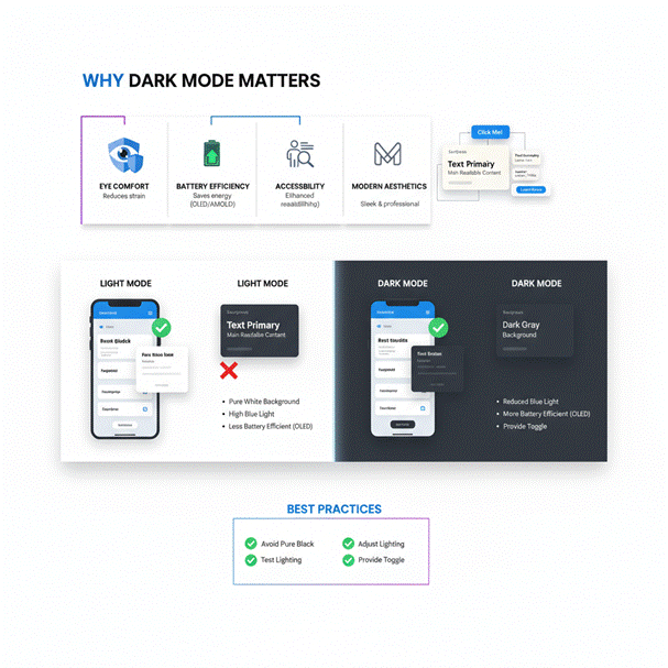
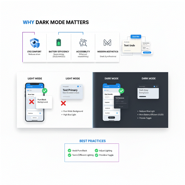
Why Dark Mode Matters:
- Eye Comfort: Lowers blue light exposure and reduces visual fatigue.
- Battery Efficiency: OLED and AMOLED screens consume less energy with darker pixels.
- Accessibility: Offers better readability for users with certain visual impairments.
- Modern Aesthetics: Dark themes feel sleek, professional, and contemporary.
Principles of Dark Mode Design
When designing dark interfaces, these core principles must guide your decisions:
1. Contrast and Readability
Dark mode requires high contrast without being jarring. Avoid using pure black (#000000) as it can create excessive contrast and strain the eyes. Instead, use dark grays (#121212 or #1E1E1E) as primary backgrounds and softer whites or off-whites for text.
2. Hierarchy and Emphasis
Users should easily distinguish primary content, secondary elements, and background layers. Use shadows, blurs, and color accents to create depth and hierarchy.
Hierarchical Diagram Suggestion:
| Layer | Purpose | Example Color |
| Background | Primary dark theme | #121212 |
| Surface | Cards, modals, secondary sections | #1E1E1E |
| Text Primary | Main readable content | #E0E0E0 |
| Text Secondary | Labels, captions, hints | #B0B0B0 |
| Accent / Action | Buttons, links, interactive elements | #FF4081 / #448AFF |
This table demonstrates a clear hierarchy of color usage, ensuring that users can navigate and comprehend content intuitively.
3. Color Palette & Accents
Colors appear differently on dark backgrounds than on light ones. Bright neon-like shades often pop too much, while muted tones can vanish. Designers must choose colors that maintain vibrancy without causing discomfort, often favoring muted blues, greens, and purples for primary accents.
4. Accessibility Considerations
Always verify that your design meets WCAG contrast standards. Ensure text is legible, icons are distinguishable, and interactive elements are easy to identify. Dark mode should enhance accessibility, not hinder it.
5. Consistency Across Platforms
Whether it’s a web application, mobile app, or desktop software, consistency in dark mode ensures that users do not get lost or confused. Tools like Figma and Sketch allow designers to maintain consistent color styles across multiple screens.
Best Practices for Dark Mode Implementation
- Avoid Pure Black – Use dark shades of gray to reduce eye strain.
- Test in Different Lighting Conditions – Ensure readability in both bright and dim environments.
- Adjust Images and Media – Use images with transparent backgrounds or adapt brightness to fit dark themes.
- Provide a Toggle – Give users the option to switch between light and dark modes easily.
- Respect Brand Identity – Ensure dark mode still aligns with your brand’s visual identity.
Dark Mode in Action: How CuriosityTech.in Implements It
At Curiosity Tech, we integrate dark mode principles into our digital platforms and client projects. Our design philosophy focuses on:
- Ergonomic interfaces that are comfortable for long hours of use.
- Balanced color palettes that maintain brand consistency.
- Accessibility-first approach, ensuring all users, regardless of visual preference or impairment, enjoy seamless navigation.
Whether you are exploring UI/UX design trends or building professional websites, understanding dark mode is critical in 2025 and beyond.
Conclusion
Dark mode is no longer optional—it’s a design expectation. By adhering to core principles like contrast, hierarchy, accessibility, and consistency, designers can craft interfaces that are visually stunning and user-friendly. At Curiosity Tech, we prioritize human-centered design, ensuring that every interaction feels intuitive and comfortable, whether in light or dark mode.
Dark mode is about more than aesthetics; it’s about creating a healthier, more engaging digital experience for users everywhere.