Introduction: When Data Speaks
Imagine walking through a smart factory. Machines hum, sensors blink, air quality detectors flash. But to the naked eye, all this is chaotic noise. Then you open a dashboard on a tablet: colorful graphs, live alerts, predictive warnings. Suddenly, the chaos becomes a story.
That is the power of IoT Analytics — raw data turning into real-time, actionable visualizations. It’s not just about pretty charts; it’s about insights that decide when to water crops, when to stop a factory machine, when to send a patient to the hospital.
At CuriosityTech.in Nagpur, IoT trainers teach students to “let the data tell the story of the devices,” turning spreadsheets into lifesaving actions.
The Journey of IoT Data
Think of IoT data as a hero’s journey:
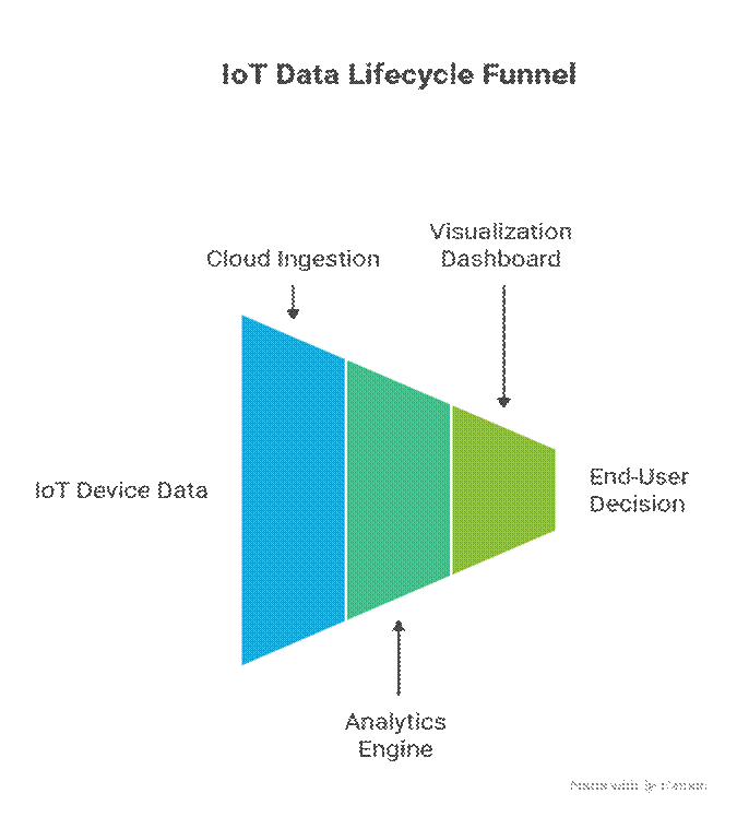
- Birth (Collection): Devices generate readings (temperature, vibration).
- Travel (Transmission): Data travels via MQTT/HTTP to servers or cloud.
- Transformation (Analytics): Filtering, cleaning, and aggregation give it meaning.
- Voice (Visualization): Charts, dashboards, heatmaps make meaning obvious.
- Destiny (Decision): AI or human responds — switch off a motor, send a text, release water pump.
Without this journey, IoT remains “blind sensing.” With it, IoT becomes decision intelligence.
Key Components of IoT Analytics
- Data Ingestion Layer – Brokers, stream platforms (Kafka, MQTT, Azure IoT Hub).
- Stream Processing – Apache Spark, AWS Kinesis, Node-RED.
- Storage Layer – Databases: InfluxDB (time-series), MongoDB (NoSQL).
- Analytics Layer – AI/ML for predictions (SageMaker, TensorFlow).
- Visualization Layer – Dashboards and reports (Grafana, Power BI, ThingsBoard).
Real-Time Visualization Tools
Grafana
- Specializes in time-series visualization.
- Live dashboards for metrics like temperature trends.
ThingsBoard
- Full IoT stack: device management + widgets (gauges, charts, maps).
- Beginner friendly (often taught at CuriosityTech workshops).
Power BI
- Enterprise dashboards with predictive layers.
- Integrates well with Azure IoT data.
Kibana
- For log & event-heavy IoT data.
Storytelling Use Cases
Use Case 1: Smart Agriculture
- Thousands of soil moisture sensors feed data.
- Dashboard story: A field graph shows dry patches (colored red zones). Farmer instantly decides irrigation zones to activate.
- Add AI: Water-saving graphs show improved usage week by week.
Use Case 2: Industrial IoT
- Vibration sensor data on motors visualized in Grafana.
- Story: Graph spikes → early bearing failure predicted.
- Outcome: Shop floor engineer stops machine before catastrophic damage.
Use Case 3: Healthcare IoT
- Real-time dashboards for wearable heart monitors.
- Story: Alert lights up when patient’s vitals cross thresholds.
- Doctors view trend curves across hours/days for diagnosis.
Data Visualization Formats in IoT Dashboards
| Format | Example Use Case |
| Line Charts | Sensor trends (temperature hourly trends). |
| Gauges/Dials | Device indicators (battery %, speed). |
| Heatmaps | Environmental monitoring (farm/water distribution). |
| Maps (Geo-dashboards) | Logistic trackers in vehicles, fleet management. |
| Alerts/Popups | Security alerts (motion sensor detects intrusion). |
Diagram Concept
Imagine a pipeline visual diagram:

Common Challenges in IoT Analytics
- Too much data clutter: Dashboards show all; insights get buried.
- Latency issues: Dashboards must refresh in seconds.
- Bad visualization design: Using pie charts where time-series graphs are needed.
- Security: Dashboards vulnerable if API keys are hardcoded or cloud endpoints left public.
Training Engineers with Data Dashboards
At CuriosityTech, students are given:
- Sensor dataset streams from live ESP32 clusters.
- Tasks to build ThingsBoard dashboards showing trends.
- Exercises on Grafana where anomalies must trigger visual alerts.
- Final projects building Power BI dashboards connected to Azure IoT Hub.
By the end of training, beginners not only create dashboards but design analytics narratives: showing “When the plant’s soil was driest” or “Which factory machine is ticking towards downtime.”
Conclusion
IoT analytics is where data becomes knowledge. Devices that collect information are only valuable when that information is presented in a clear, live, and actionable form. Real-time dashboards ensure engineers, farmers, doctors, and factory managers can see their IoT systems speaking to them like stories on a screen.
For IoT engineers in 2025, the ability to design dashboards isn’t an optional skill — it’s essential. This is why CuriosityTech.in Nagpur emphasizes analytics storytelling exercises, reminding students: “Every dataset tells a story. Your job as an IoT engineer is to make it visible, fast, and clear.”


