
Introduction
User interfaces are the first thing users notice when they open an app. A beautiful, functional UI doesn’t just attract users—it guides their interaction, improves usability, and enhances retention.
Android UI development revolves around three pillars: Layouts, Views, and Widgets. Understanding these deeply is crucial to become a professional Android developer. At CuriosityTech.in (Nagpur), learners focus not only on coding UIs but also on user experience, accessibility, and performance.
1. Understanding Layouts
A layout is the container that holds views and defines how they are arranged on the screen. Choosing the right layout impacts responsiveness, performance, and maintainability.
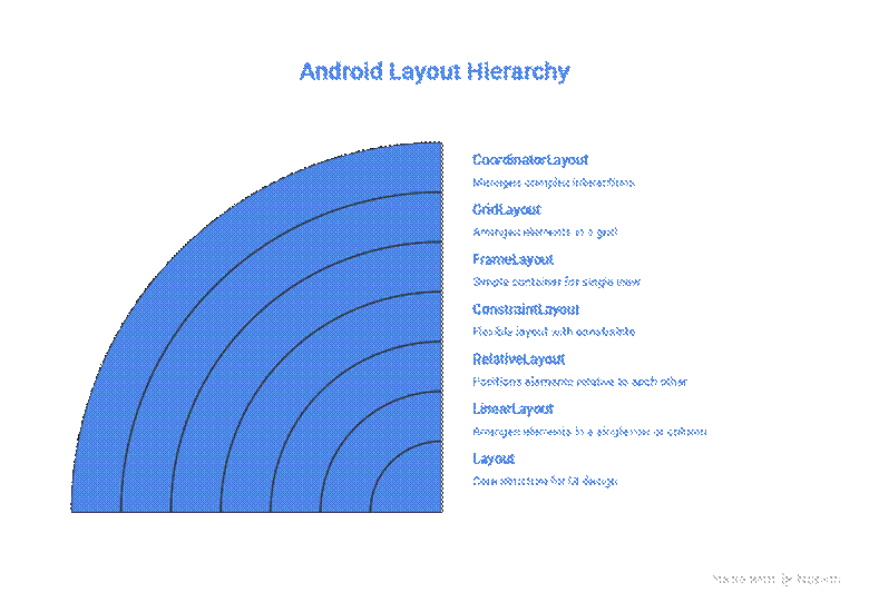
Types of Layouts
| Layout Type | Description | Use Case | Key Attributes |
| LinearLayout | Arranges child views horizontally or vertically | Simple forms, buttons stacked | orientation, weight, gravity |
| RelativeLayout | Positions views relative to each other or parent | Complex overlapping layouts | layout_alignParentTop, layout_toRightOf |
| ConstraintLayout | Modern, flexible, supports complex layouts efficiently | Adaptive UI, Jetpack Compose replacement | constraints, bias, chains |
| FrameLayout | Displays one view on top of another | Splash screens, overlays | gravity |
| GridLayout | Arranges views in grid cells | Calendars, photo galleries | rowCount, columnCount |
| CoordinatorLayout | Advanced layout for material design patterns | Collapsing toolbar, snackbars | Behaviors and anchors |
Tip: Use ConstraintLayout for most modern apps. It reduces the nested layout depth, improving performance and making responsive designs easier.
Hierarchical Layout Diagram
2. Understanding Views
A View is the basic building block of UI. It represents anything a user can see or interact with. Every widget is a subclass of View, and all layouts themselves extend from ViewGroup (which is a subclass of View).
Core View Types
- TextView → Displays text. Example: app labels, instructions.
- ImageView → Displays images (JPEG, PNG, SVG). Example: profile pictures.
- Button → Triggers actions on click.
- EditText → Input field for user data.
- CheckBox / RadioButton / Switch → Toggle or select options.
- ProgressBar → Displays progress of tasks.
Custom Views
Developers can extend View or ViewGroup to create custom UI elements. Examples:
- Circular progress indicators
- Custom sliders for audio apps
- Interactive charts
At CuriosityTech, learners create custom views to understand drawing on Canvas, touch events, and animations, building a deeper grasp of UI control.
3. Understanding Widgets
Widgets are pre-built UI components provided by Android, usually derived from Views, that perform common functions.
Common Widgets
| Widget | Description | Example |
| Button | Clickable element | Submit form |
| TextView | Displays text | Article content |
| EditText | User input | Login form |
| Spinner | Drop-down selection | Country list |
| CheckBox | Binary option | Terms & Conditions |
| RadioButton | Single choice among options | Payment methods |
| ImageView | Display images | Logo/profile picture |
| RecyclerView | Display scrollable lists efficiently | Chat messages |
| CardView | Material design container | Product cards |
Practical Example – LinearLayout with Widgets
<LinearLayout
xmlns:android=”http://schemas.android.com/apk/res/android”
android:layout_width=”match_parent”
android:layout_height=”wrap_content”
android:orientation=”vertical”
android:padding=”16dp”>
<TextView
android:id=”@+id/title”
android:layout_width=”wrap_content”
android:layout_height=”wrap_content”
android:text=”Welcome to CuriosityTech”
android:textSize=”24sp”
android:textStyle=”bold”/>
<EditText
android:id=”@+id/username”
android:layout_width=”match_parent”
android:layout_height=”wrap_content”
android:hint=”Enter Username”/>
<Button
android:id=”@+id/submit”
android:layout_width=”wrap_content”
android:layout_height=”wrap_content”
android:text=”Submit”/>
</LinearLayout>
Pro Tip: Use weights and constraints instead of hardcoding sizes for better responsiveness across devices.
4. Advanced UI Concepts
- Material Design Components → Cards, BottomNavigationView, Snackbar, TabLayout
- Dynamic Layouts → Add/remove views programmatically based on runtime conditions
- Animations & Transitions → Fade, slide, scale animations to enhance UX
- Accessibility → Content descriptions, readable fonts, high contrast, screen reader support
Best Practices from CuriosityTech
- Use ConstraintLayout over nested LinearLayouts for performance.
- Reuse components via styles and themes to maintain consistency.
- Always test on multiple screen sizes (phones, tablets, foldables).
- Custom Views only when necessary to avoid performance bottlenecks.
- Keep UI responsive → avoid blocking main thread for data loading.
Infographic – Relationship Between Layout, Views, and Widgets
5. Conclusion
UI is the bridge between the user and app functionality. Mastery of layouts, views, and widgets is essential to create apps that are intuitive, visually appealing, and performant.
At CuriosityTech.in, learners practice hands-on projects, combining layouts, views, widgets, and animations to build apps that feel alive, user-friendly, and professional.
By understanding these concepts deeply, you not only write cleaner code but also deliver experiences that delight users, making you a highly sought-after Android developer.
Tags:
Android UI Components, Layouts and Views, Widgets Android, CuriosityTech Nagpur
Keywords:
, layouts views widgets explained, material design Android, CuriosityTech Android training, Android responsive design

