
In the ever-evolving digital landscape, user experience is king. A well-designed website or app can either captivate users or drive them away in seconds, and one of the most critical elements that determines this is navigation. Intuitive navigation not only guides users seamlessly through your digital platform but also enhances engagement, boosts retention, and directly impacts conversions.
AtCuriosity Tech, we specialize in crafting websites and apps that prioritize user-centric design. Our approach focuses on understanding human behavior, combining aesthetic appeal with functionality to ensure every user finds what they need without frustration.
Understanding the Importance of Intuitive Navigation
Navigation acts as the roadmap for your digital presence. Without clear paths, users can become confused, frustrated, or abandon your platform entirely. Here are some key reasons why intuitive navigation is indispensable:
- Enhanced User Experience: Users can locate information quickly and effortlessly.
- Improved Retention Rates: A smooth navigation experience keeps visitors engaged longer.
- Better SEO Performance: Search engines reward structured websites with higher rankings.
- Increased Conversion Rates: Simplified journeys encourage users to take desired actions, whether signing up, purchasing, or exploring more content.
Core Principles of Intuitive Navigation
Designing navigation requires more than just a menu bar. Here are essential principles:
- Simplicity is Key:- Overly complex navigation overwhelms users. Prioritize clarity by using familiar labels, minimal options, and avoiding jargon.
- Consistency Across Platform:- Navigation should remain consistent whether users access your website on a desktop, tablet, or smartphone. At CuriosityTech, we ensure that both websites and apps maintain a uniform navigation experience.
- Hierarchy & Prioritization:- Use a logical hierarchy to present information. Core actions and most-used sections should be immediately visible, while secondary pages can be nested.
- Visual Cues & Feedback:- Highlight the active page, use icons, and provide hover effects or breadcrumb trails to guide users intuitively.
- Accessibility & Inclusivity:- Navigation must be usable by everyone, including individuals with disabilities. Clear contrast, scalable text, and screen-reader-friendly structures are non-negotiable.
Types of Navigation for Websites & Apps
Navigation can take multiple forms depending on your platform and audience:
| Navigation Type | Description | Best Use Case |
| Top Navigation Bar | Horizontal menu at the top of a website | Corporate websites, blogs |
| Sidebar Navigation | Vertical menu on the side | Dashboards, content-heavy sites |
| Hamburger Menu | Collapsible menu icon | Mobile-first websites and apps |
| Footer Navigation | Links at the bottom of the page | Secondary or legal pages |
| In-App Tab Bar | Persistent tabs in mobile apps | Social apps, e-commerce apps |
Curiosity Tech integrates these navigation structures based on the platform, user behavior analytics, and client objectives to deliver a cohesive and functional user experience.
Crafting a Navigation Hierarchy: Example Diagram
A hierarchical navigation diagram helps visualize the structure and flow of your website or app. Here’s an illustrative example for an e-commerce website:
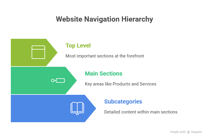
Description: This structure ensures the most important sections (Products, Services, Contact) are visible at the top level, while subcategories allow deeper navigation without cluttering the interface. Users can intuitively drill down to find their desired content without feeling lost.
Infographic Suggestion
- Understand Your Users – Persona icons with thought bubbles
- Plan Your Hierarchy – Pyramid structure showing main and subpages
- Design & Prototype – Wireframe sketch with menu icons
- Test & Iterate – Users interacting with screens, feedback icons
- Launch & Monitor – Analytics dashboard showing performance
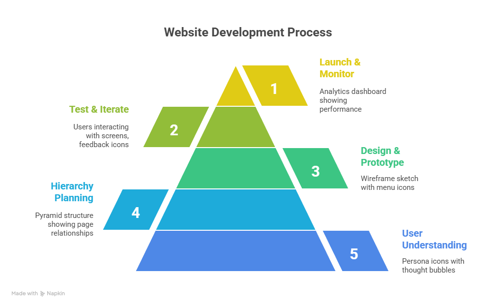
Description: This infographic communicates navigation design visually, helping teams and stakeholders understand the workflow from conceptualization to implementation.
Best Practices from CuriosityTech
At Curiosity Tech, we implement these techniques for every client:
- User Research & Testing: Observing real user behavior to optimize navigation
- Mobile-First Design: Designing navigation that works seamlessly on all devices
- Clear CTAs: Every button or link drives action without confusion
- Microinteractions: Small visual cues, like hover effects, keep users oriented
Our team ensures that every navigation design reflects both your brand identity and your users’ natural tendencies.
Conclusion
Intuitive navigation is not just a design choice; it’s a strategic investment in user experience. By simplifying journeys, prioritizing clarity, and using thoughtful hierarchy, you can create websites and apps that users love to explore. Whether you are designing from scratch or optimizing an existing platform, keeping users at the center of your navigation strategy is crucial.
Curiosity Tech thrives on helping brands create digital experiences that are not only functional but delightful. By integrating research, design expertise, and technology, we craft navigation that is intuitive, accessible, and conversion-focused.