
Introduction (Tool-Focused Beginner Tutorial Style)
Google Data Studio (GDS) is a free, cloud-based reporting and visualization tool that allows analysts to create interactive dashboards, generate reports, and share insights with stakeholders in real time.
Imagine a retail chain in Nagpur tracking sales across multiple regions. Traditional spreadsheets are cumbersome for presenting insights to management. Google Data Studio simplifies this process, transforming raw data into interactive, shareable dashboards that communicate insights clearly.
At CuriosityTech.in, learners gain hands-on experience with GDS, connecting various data sources, designing dashboards, and creating reports that drive business decisions.
Step 1: Getting Started
- Go to Google Data Studio
- Sign in with a Google account
- Click “Create” → “Report”
- Connect your data source:
- Google Sheets
BigQuery
SQL databases
- CSV files
- Google Sheets
Tip: Ensure your dataset is clean and structured before importing.
Step 2: Connecting Data
- Google Sheets Example:
- Select Google Sheets as a connector
Choose your sales dataset
Click “Add to Report”
- Review data types (text, number, date) and make adjustments if needed
- Select Google Sheets as a connector
- SQL / BigQuery Example:
- Select BigQuery connector
Authenticate and select dataset
- Apply necessary filters or queries before visualizing
- Select BigQuery connector
Step 3: Designing Your Dashboard
- Add Charts:
- Bar, Column, Line, Pie
- Scatter, Area, Geo Maps for regional data
- Bar, Column, Line, Pie
- Add Controls:
- Drop-down filters for Region, Product, Month
- Date range controls to allow dynamic analysis
- Drop-down filters for Region, Product, Month
- Customize Appearance:
- Fonts, colors, labels for clarity
- Add KPI cards for key metrics like total revenue, average order value
- Fonts, colors, labels for clarity
Example:- Sales Dashboard for Nagpur stores showing:
- Revenue by region (Geo Map)
- Monthly revenue trend (Line Chart)
- Top 5 products (Bar Chart)
- Total revenue and total quantity (KPI Cards)
Step 4: Example – Project Workflow in GDS
| Step | Action / Feature | Purpose |
| Connect Data | Google Sheets / BigQuery | Import structured dataset |
| Add Charts | Line, Bar, Pie, Geo Map | Visualize metrics and trends |
| Add Controls | Drop-down, Date Range | Enable interactive exploration |
| Customize Appearance | Colors, Labels, Fonts | Make dashboard intuitive & readable |
| Add KPI Cards | Metrics like Revenue, Quantity | Highlight critical numbers |
| Apply Filters | Region, Product, Month | Allow user-specific views |
| Share Report | Share link or embed | Distribute to stakeholders |
Step 5: Interactive Features
- Drill-Down Charts: Click to view detailed metrics for regions or products
- Date Range Comparison: Analyze trends over multiple periods
- Calculated Fields: Create metrics like Revenue per Unit or Profit Margin
- Blending Data: Combine multiple datasets (e.g., sales + marketing spend)
Tip: Interactivity allows stakeholders to explore data themselves, reducing repetitive reporting tasks.
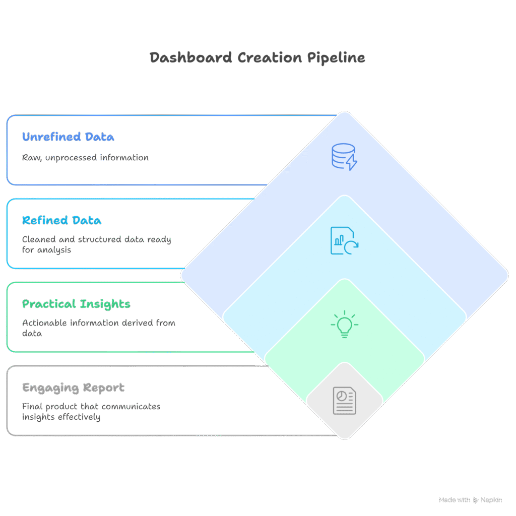
Step 6: Workflow Diagram
Step 7: Real-World Scenario
Scenario:- Nagpur retail chain wants a monthly performance dashboard
- Import sales dataset into GDS
- Create line chart for monthly revenue trends
- Use geo map to show revenue by region
- Add bar chart for top 10 products
- Include KPI cards for total revenue, total orders, average order value
- Apply filters for region and product category
Outcome: Executives can interactively explore sales data, identify growth opportunities, and make informed decisions efficiently.
At CuriosityTech.in, learners complete projects using Google Data Studio, building dashboards for retail, finance, and marketing scenarios in Nagpur to gain practical experience for professional analytics roles.
Step 8: Common Mistakes
- Importing unclean or unstructured data → visualizations break
- Overloading dashboards with too many charts → reduces clarity
- Ignoring audience needs → irrelevant metrics
- Not using interactive controls → static insights
- Poor labeling or formatting → reduces readability
Step 9: Tips to Master Google Data Studio
- Start with clean, structured datasets
- Focus on key KPIs and metrics before adding detailed charts
- Use interactive controls for flexibility
- Learn calculated fields and data blending for advanced insights
- At CuriosityTech.in, learners practice hands-on GDS dashboards, integrating SQL and Excel outputs for real-world reporting projects
Infographic Description: “Google Data Studio Workflow”
A stepwise dashboard creation pipeline, emphasizing transformation from raw data → interactive, actionable report.
Conclusion
Google Data Studio enables analysts to transform data into interactive, shareable dashboards, making insights accessible to stakeholders and supporting data-driven decision-making.
At CuriosityTech.in, learners in Nagpur gain hands-on experience creating GDS dashboards, integrating multiple data sources, and producing professional reports ready for corporate presentation. Contact +91-9860555369 or contact@curiositytech.in to start mastering Google Data Studio for 2025.