

Introduction (Comparative Analysis Style)
Choosing the right analytics and visualization tool is critical for a data analyst’s productivity, efficiency, and career growth. Each tool has unique capabilities, and understanding them can save time and optimize business decision-making.
Imagine a Nagpur-based retail company needing to analyze sales, customer behavior, and inventory data. Should they use Excel for simplicity, Power BI for interactive dashboards, or Tableau for advanced visual storytelling?
At CuriosityTech.in, learners are trained to evaluate tools based on practical requirements, ensuring they gain skills aligned with industry demands in 2025.
Step 1: Overview of Tools
| Tool | Description | Target Users | Primary Use Case |
| Excel | Spreadsheet software with formulas, pivot tables, charts | Beginners to intermediate | Data cleaning, analysis, reporting |
| Power BI | Microsoft’s interactive data visualization and business intelligence tool | Analysts, BI professionals | Interactive dashboards, corporate reporting |
| Tableau | Data visualization platform for creating interactive and shareable dashboards | Analysts, visualization experts | Advanced visual storytelling, exploratory analysis |
Step 2: Key Comparison Parameters
| Parameter | Excel | Power BI | Tableau |
| Learning Curve | Easy to moderate | Moderate | Moderate to High |
| Data Handling Capacity | Medium (millions of rows with 64-bit Excel) | High (connects to multiple large datasets) | High (optimized for large datasets) |
| Visualization Capabilities | Basic to moderate (charts, conditional formatting) | Advanced (interactive dashboards, drill-downs) | Advanced (rich visuals, storytelling dashboards) |
| Integration & Connectivity | Limited (CSV, SQL, small APIs) | Extensive (SQL, SharePoint, cloud services) | Extensive (databases, APIs, cloud services) |
| Collaboration | Basic (shared files) | High (cloud sharing, real-time dashboards) | High (server-based sharing, Tableau Public/Online) |
| Cost | Low (part of Microsoft Office) | Medium to High (Pro license) | Medium to High (Creator/Professional license) |
Step 3: Detailed Analysis
Excel
- Strengths: Simple formulas, pivot tables, flexible calculations, widely used
- Limitations: Limited interactivity, manual updates, not ideal for very large datasets
- Best Use Case: Quick data analysis, financial modeling, small-scale dashboards
Power BI
- Strengths: Interactive dashboards, real-time reporting, seamless Microsoft integration
- Limitations: Limited custom visuals compared to Tableau, learning DAX formulas
- Best Use Case: Enterprise reporting, sales dashboards, integrating multiple data sources
Tableau
- Strengths: Advanced visual storytelling, intuitive drag-and-drop interface, robust exploratory analysis
- Limitations: Requires learning Tableau Desktop, higher licensing costs for large teams
- Best Use Case: Data storytelling, market research visualization, interactive client-facing dashboards
Step 4: Real-World Scenario
Scenario: Nagpur retail chain wants to track monthly sales and customer trends.
- Excel Approach:
- Pivot tables for revenue by product
Charts for top-performing regions
- Manual updates for monthly reports
- Pivot tables for revenue by product
- Power BI Approach:
- Connects to SQL database
Interactive dashboards for sales, region, and product performance
- Automatic refresh and real-time updates
- Connects to SQL database
- Tableau Approach:
- Drag-and-drop visualization for monthly sales, customer churn, and revenue by segment
Storytelling dashboards to present to management
- Advanced analytics and predictive trend visualization
- Drag-and-drop visualization for monthly sales, customer churn, and revenue by segment
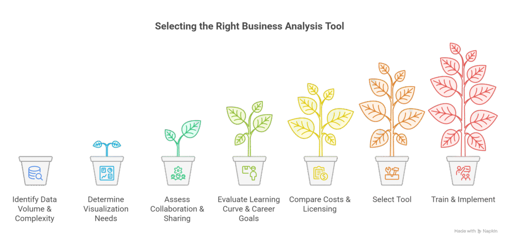
Step 5: Decision-Making Workflow
Step 6: Tips for Choosing the Right Tool
- Beginner or small dataset: Start with Excel
- Enterprise dashboards and Microsoft ecosystem: Use Power BI
- Advanced storytelling or large-scale exploratory analysis: Use Tableau
- Hybrid Approach: Learn Excel for fundamentals, then specialize in Power BI or Tableau
- At CuriosityTech.in, learners train on all three tools, building a portfolio of dashboards and reports suited for diverse business needs.
Step 7: Table – Tool Strengths, Weaknesses & Use Cases
| Tool | Strengths | Weaknesses | Ideal Use Case |
| Excel | Flexible, formulas, pivot tables | Manual updates, limited interactivity | Quick analysis, financial modeling |
| Power BI | Interactive dashboards, real-time updates | Limited visual customization | Enterprise reporting, real-time monitoring |
| Tableau | Advanced visuals, storytelling dashboards | Higher cost, learning curve | Data storytelling, client-facing presentations |
Step 8: Integration of Learning Path
- Start with Excel fundamentals → data cleaning, pivot tables, basic charts
- Advance to Power BI → connect to databases, create interactive dashboards
- Master Tableau → explore advanced visualizations, predictive insights, storytelling dashboards
- CuriosityTech.in provides structured training in all three, enabling learners in Nagpur to gain practical, portfolio-ready skills for 2025 analytics roles
Conclusion
Choosing the right tool depends on data complexity, visualization needs, collaboration, and career goals. Excel is ideal for fundamentals, Power BI excels in enterprise dashboards, and Tableau shines in storytelling and exploratory analysis.
At CuriosityTech.in, learners gain hands-on experience with Excel, Power BI, and Tableau, building dashboards, generating insights, and preparing for professional analytics roles in 2025. Contact +91-9860555369 or contact@curiositytech.in to start mastering these analytics tools.

