Introduction (Storytelling & Communication Style)
Numbers alone rarely persuade decision-makers. Data storytelling is the art of combining data, visuals, and narrative to communicate actionable insights effectively.
Imagine a retail manager in Nagpur reviewing sales dashboards. A spreadsheet showing revenue numbers won’t inspire action. But a story highlighting the top-performing products, revenue trends, and regional opportunities does. This is where data storytelling transforms raw analytics into a compelling business narrative.
At CuriosityTech.in, learners are trained to craft stories from data, combining analytics, visualizations, and narrative techniques to influence business decisions confidently.
Step 1: Understand Your Audience
- Identify decision-makers: CEO, marketing team, operations
- Determine what insights matter most: revenue trends, customer behavior, product performance
- Tailor complexity and visuals to audience expertise
Tip: A CEO may prefer high-level KPIs, while analysts may want detailed charts and tables.
Step 2: Structure Your Data Story
- Introduction: Context and objective
- Challenge/Problem: Explain business problem with relevant data
- Analysis: Present findings with charts, tables, and insights
- Recommendation: Suggest actionable next steps based on insights
- Conclusion: Summarize key takeaways
Example:
- Introduction: Quarterly sales review for Nagpur stores
- Challenge: Identify products with declining revenue
- Analysis: Use bar charts for product performance, line charts for monthly trends
- Recommendation: Promote high-potential products, discount slow-moving items
- Conclusion: Strategic actions to maximize revenue
Step 3: Use Effective Visualizations
| Visualization Type | Purpose | Example Use Case |
| Bar Chart | Compare categories | Product revenue |
| Line Chart | Show trends over time | Monthly sales |
| Pie Chart | Show proportion | Revenue by region |
| Heatmap | Identify correlations | Product vs Region performance |
| KPI Card | Highlight key metrics | Total revenue, top product |
| Dashboard | Combine visuals interactively | Executive report |
Tools: Excel, Power BI, Tableau, Python (Matplotlib, Seaborn)
Step 4: Example – Data Storytelling with Sales Data
Scenario: Retail chain wants to analyze quarterly sales performance.
- Collect and clean sales dataset (SQL + Excel)
- Identify top 5 products and their revenue contribution
- Visualize revenue trends using line charts and bar charts
- Highlight regional differences using maps or heatmaps
- Craft narrative explaining trends, outliers, and opportunities
- Recommend strategic actions for sales improvement
Outcome: Executives can make data-driven decisions like increasing promotions on high-margin products and optimizing inventory.
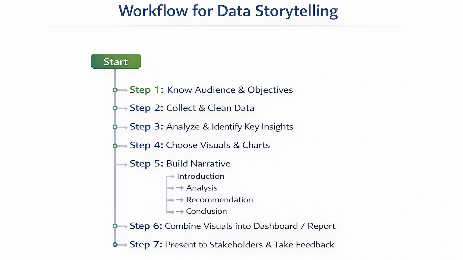
Step 5: Workflow for Data Storytelling (Textual Flowchart)
Step 6: Table – Storytelling Techniques, Tools, and Applications
| Technique | Tool / Feature | Application Example |
| Visual Comparison | Bar Chart, Line Chart | Product performance vs revenue |
| Highlight Trends | Line Chart, Area Chart | Monthly revenue patterns |
| Emphasize KPIs | KPI Card, Conditional Formatting | Top-selling products, revenue targets |
| Correlation Insight | Heatmap, Scatter Plot | Product vs Region correlation |
| Narrative Flow | Storyboard, Dashboard | Executive report with recommendation |
Step 7: Common Mistakes in Data Storytelling
- Overloading charts with too much data → reduces clarity
- Using inappropriate chart types → miscommunication
- Ignoring audience perspective → insights not actionable
- Not integrating narrative → raw numbers without context
- Poor visual design → reduces engagement
Step 8: Tips to Master Data Storytelling
- Start with a clear objective and audience
- Use consistent colors, labels, and formatting for clarity
- Combine quantitative and qualitative insights
- Highlight key takeaways and actionable recommendations
At CuriosityTech.in, learners practice storytelling by creating dashboards and reports for retail, finance, and healthcare, developing skills to communicate data effectively to decision-makers
Infographic Description: “Data Storytelling Pipeline”
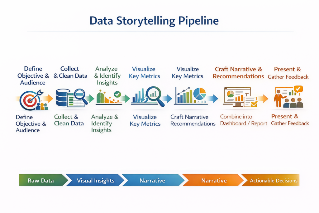
- Stage 1: Define Objective & Audience
- Stage 2: Collect & Clean Data
- Stage 3: Analyze & Identify Insights
- Stage 4: Visualize Key Metrics
- Stage 5: Craft Narrative & Recommendations
- Stage 6: Combine into Dashboard / Report
- Stage 7: Present & Gather Feedback
Conclusion
Data storytelling bridges the gap between analytics and decision-making. By combining data, visuals, and narrative, analysts can influence business outcomes and drive strategic decisions.
At CuriosityTech.in, learners in Nagpur gain hands-on experience in crafting data stories with real-world datasets, using Excel, SQL, Power BI, Tableau, and Python to communicate insights effectively. Contact +91-9860555369 or contact@curiositytech.in to start mastering data storytelling for 2025.