

In today’s digital landscape, accessibility is no longer optional—it is essential. When we talk about UI/UX design, we often focus on aesthetics, interaction flows, and visual appeal. However, designing for everyone means thinking beyond the average user. It is about ensuring that your digital products are usable by people of all abilities, including those with disabilities. At CuriosityTech.in, our approach embraces inclusivity as a core principle, ensuring technology serves everyone without barriers.
Why Accessibility Matters in UI/UX
Accessibility ensures that users with visual, auditory, cognitive, or motor impairments can access and interact with your digital product effectively. According to the World Health Organization, over 1 billion people worldwide live with some form of disability, making accessibility a crucial aspect of design strategy.
Here’s why accessible design matters:
- Expands Audience Reach – Designing inclusively allows more people to engage with your platform, expanding your potential user base.
- Improves Usability for All – Features that aid accessibility, like proper color contrast or keyboard navigation, enhance usability for everyone, not just users with disabilities.
- Legal Compliance – Many countries require digital accessibility under laws like the ADA (Americans with Disabilities Act) and the WCAG (Web Content Accessibility Guidelines).
- Brand Reputation – Accessible design communicates empathy, inclusivity, and responsibility, boosting trust in your brand.
At CuriosityTech.in, we believe accessibility is an ethical imperative and a strategic advantage. Whether it’s our website, mobile applications, or digital platforms, every design choice reflects this ethos.
Key Accessibility Principles in UI/UX
Accessibility in design revolves around four main principles, often remembered using the acronym POUR:
| Principle | Description | Example in UI/UX |
| Perceivable | Information and interface must be presentable to users in ways they can perceive. | Text alternatives for images, captions for videos, adjustable font sizes. |
| Operable | Interface components and navigation must be usable by everyone. | Keyboard navigability, voice commands, consistent menu structures. |
| Understandable | Information and the operation of the interface must be understandable. | Clear instructions, predictable navigation, consistent labeling. |
| Robust | Content must be robust enough to work across various devices and assistive technologies. | Compatibility with screen readers, mobile devices, and older browsers. |
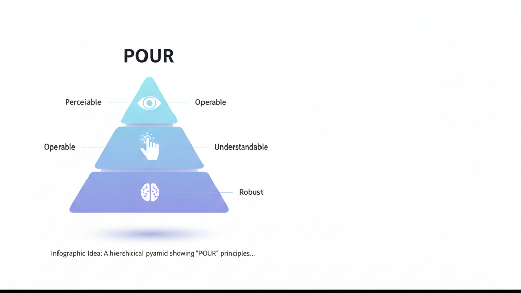
Infographic Idea: A hierarchical pyramid showing “POUR” principles, with icons representing each principle (Eye for Perceivable, Hand for Operable, Brain for Understandable, and Gear for Robust). This can visually guide readers to understand the foundation of accessibility design.
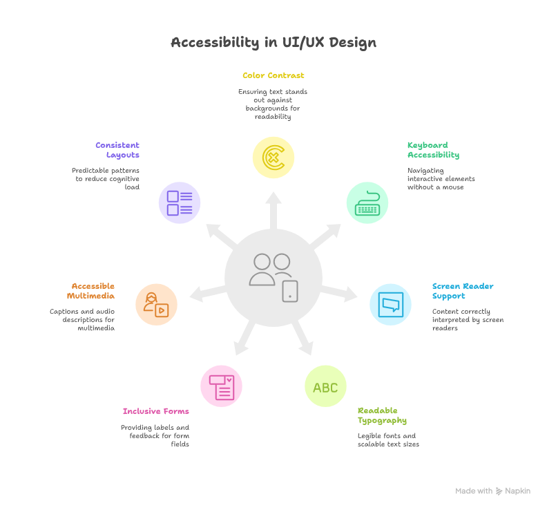
Practical Accessibility Techniques for Designers
- Color Contrast & Visual Hierarchy – Ensure text stands out against backgrounds. Tools like WCAG Contrast Checker help determine readability.
- Keyboard Accessibility – Users should navigate all interactive elements without a mouse. Test tab orders and focus indicators.
- Screen Reader Support – Semantic HTML, ARIA labels, and proper heading structures ensure content is correctly interpreted by screen readers.
- Readable Typography – Use legible fonts, sufficient spacing, and scalable text sizes.
- Inclusive Forms & Inputs – Provide labels, instructions, and error feedback for form fields.
- Accessible Multimedia – Captions, transcripts, and audio descriptions make multimedia content usable for all.
- Consistent Layouts – Predictable patterns and repetition reduce cognitive load for users with learning difficulties.
At CuriosityTech.in, we integrate these practices into all client projects. For instance, our interactive dashboards and front-end user forms are designed to be intuitive and fully accessible across devices.
Designing for Diverse Abilities: A Real-World Perspective
Imagine a user navigating your website with color blindness. Without proper contrast, vital buttons or alerts might become invisible. Another user might rely solely on keyboard navigation due to limited motor abilities. By implementing accessible design principles, these users can experience your interface as smoothly as anyone else.
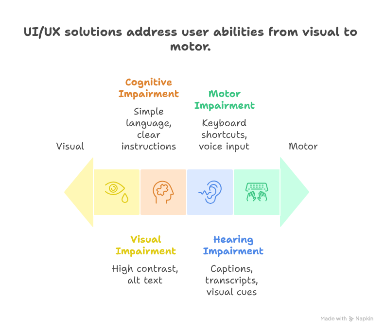
Hierarchical Table Example:
| User Ability | Challenge | UI/UX Solution |
| Visual Impairment | Cannot distinguish colors | High contrast, alt text, screen reader compatibility |
| Hearing Impairment | Cannot hear audio | Captions, transcripts, visual cues |
| Cognitive Impairment | Difficulty understanding content | Simple language, consistent layout, clear instructions |
| Motor Impairment | Difficulty using mouse | Keyboard shortcuts, voice input, accessible form fields |
CuriosityTech.in’s Approach to Accessibility
Accessibility at CuriosityTech.in is woven into every stage of the design process:
- Research & User Testing: We engage users with diverse abilities to test prototypes.
- Inclusive Design Guidelines: Our internal framework ensures that every element—from buttons to forms—is accessible.
- Continuous Improvement: Accessibility is not a one-time effort. We track analytics and feedback to optimize interfaces.
Our goal is to make every digital experience inclusive, intuitive, and enjoyable. Whether you interact with our website or our client platforms, accessibility is a non-negotiable standard.
Conclusion
Designing for everyone is more than compliance—it’s about empathy, usability, and expanding your impact. By embracing accessibility principles, designers ensure that no user is left behind. CuriosityTech.in continues to champion accessibility, combining deep technical expertise with a human-centered approach. When we design inclusively, we don’t just improve experiences; we empower individuals, strengthen communities, and build a more equitable digital world.