
Introduction (Statistical Insights + Reporting Style)
Descriptive statistics are the foundation of data analysis, enabling analysts to summarize, visualize, and interpret data. They help turn raw numbers into meaningful insights that can guide decision-making.
Imagine a retail chain in Nagpur reviewing last quarter’s sales. Management wants answers:
- What is the average revenue per product?
- Which products have high variability in sales?
- Are there extreme outliers skewing performance?
Descriptive statistics provide answers, allowing analysts to communicate insights effectively. At CuriosityTech.in, learners are trained to combine statistics with visualization, Excel, Python, and SQL for complete analytical proficiency.
Step 1: Key Measures of Descriptive Statistics
Central Tendency
- Mean: Average value
data[‘Revenue’].mean()
- Median: Middle value
data[‘Revenue’].median()
- Mode: Most frequent value
data[‘Product’].mode()
Dispersion
- Range: Difference between max and min
data[‘Revenue’].max() – data[‘Revenue’].min()
- Variance: Measure of spread
data[‘Revenue’].var()
- Standard Deviation (SD): Square root of variance
data[‘Revenue’].std()
- Interquartile Range (IQR): Difference between 75th and 25th percentile
data[‘Revenue’].quantile(0.75) – data[‘Revenue’].quantile(0.25)
Shape of Distribution
- Skewness: Measure of asymmetry
data[‘Revenue’].skew()
- Kurtosis: Measure of peakedness
data[‘Revenue’].kurt()
Step 2: Visualizing Descriptive Statistics
- Histogram: Distribution of revenue
sns.histplot(data[‘Revenue’], bins=20, kde=True)
plt.show()
- Boxplot: Detect outliers
sns.boxplot(x=’Product’, y=’Revenue’, data=data)
plt.show()
- Bar Chart: Show frequencies of categorical variables
Step 3: Applying Descriptive Statistics in Excel
- Mean: =AVERAGE(B2:B100)
- Median: =MEDIAN(B2:B100)
- Mode: =MODE.SNGL(B2:B100)
- Standard Deviation: =STDEV.P(B2:B100)
- Variance: =VAR.P(B2:B100)
- Range: =MAX(B2:B100)-MIN(B2:B100)
Step 4: Applying Descriptive Statistics in SQL
- Average Revenue:
SELECT AVG(Revenue) FROM Sales;
- Maximum & Minimum Revenue:
SELECT MAX(Revenue), MIN(Revenue) FROM Sales;
- Standard Deviation:
SELECT STDDEV(Revenue) FROM Sales;
- Count & Frequency:
SELECT Product, COUNT(*) as Frequency FROM Sales GROUP BY Product;
Step 5: Table – Key Descriptive Statistics & Use Cases
| Measure | Purpose | Example Insight |
| Mean | Average value | Average revenue per product ₹5,000 |
| Median | Middle value | Median revenue shows central tendency |
| Mode | Most frequent value | Most sold product |
| Range | Spread of data | Difference between top & low revenue |
| Variance | Measure of dispersion | Identify high variability in product sales |
| Standard Deviation | Spread around mean | Detect consistency of revenue |
| IQR | Spread of middle 50% | Detect extreme outliers |
| Skewness | Asymmetry of distribution | Positive skew indicates high revenue outliers |
| Kurtosis | Peakedness of distribution | High kurtosis indicates sharp peaks |
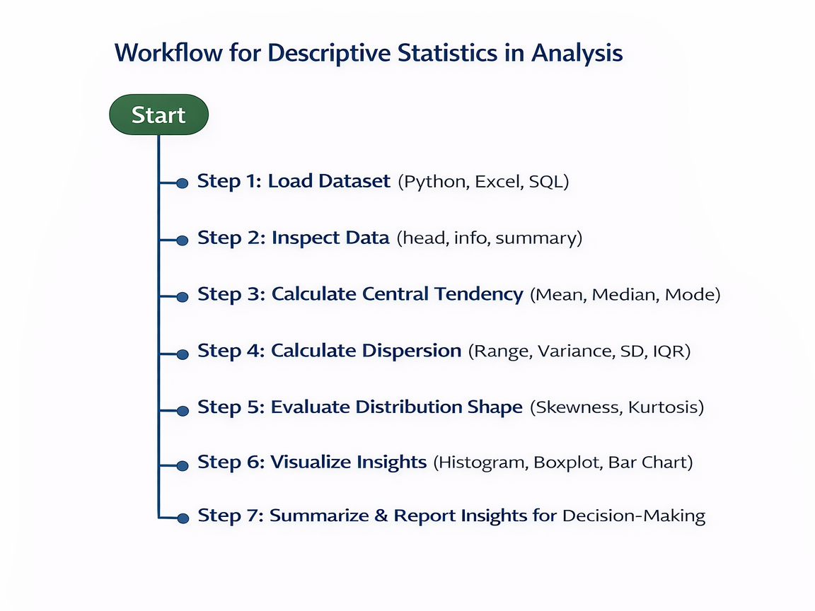
Step 6: Workflow for Descriptive Statistics in Analysis (Textual Flowchart)
Step 7: Real-World Scenario
Scenario: Retail sales analysis in Nagpur:
- Load sales dataset of 10,000 transactions
- Compute mean, median, mode of revenue to understand central tendency
- Identify products with high variability using SD and variance
- Detect outliers via boxplots and IQR
- Present results in a dashboard or report
Outcome: Management understands which products are consistent revenue drivers and which products require attention.
At CuriosityTech.in, learners practice real-world statistics exercises, integrating Python, Excel, and SQL to generate actionable insights for business.
Common Mistakes
- Relying solely on mean without considering outliers
- Ignoring data distribution shape
- Using wrong formulas or aggregation methods
- Failing to visualize results for clarity
- Not interpreting statistics in business context
Tips to Master Descriptive Statistics
- Always visualize data alongside calculations
- Understand when to use mean vs median
- Use Excel, Python, and SQL interchangeably for practice
- Connect statistics to business decisions
- At CuriosityTech.in, learners create interactive reports combining descriptive statistics and visual dashboards for deeper insight
Infographic Description: “Descriptive Statistics Pipeline”
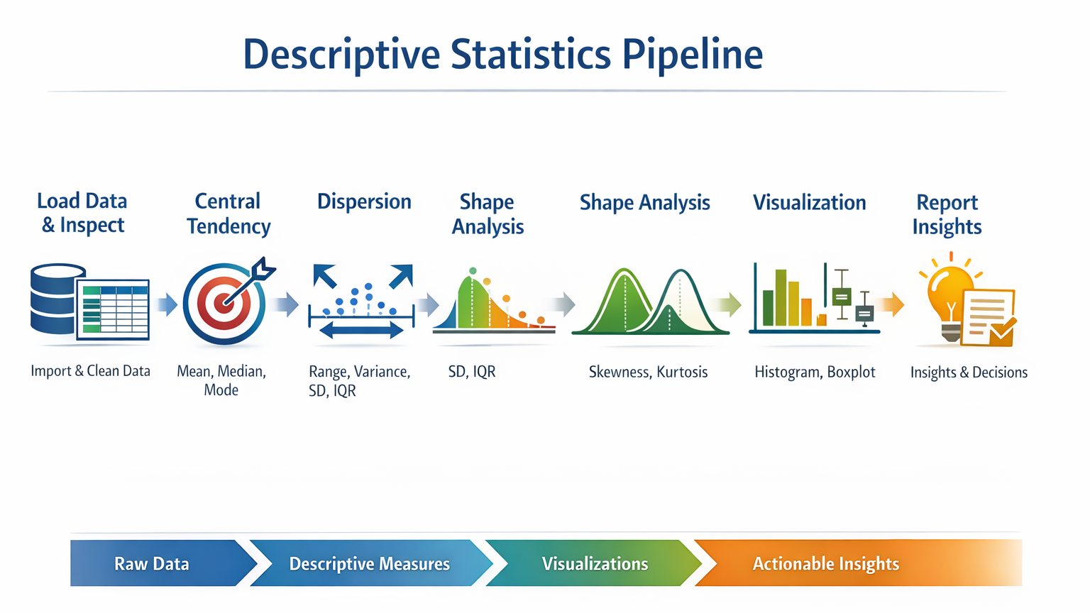
- Stage 1: Load Data & Inspect
- Stage 2: Central Tendency (Mean, Median, Mode)
- Stage 3: Dispersion (Range, Variance, SD, IQR)
- Stage 4: Shape Analysis (Skewness, Kurtosis)
- Stage 5: Visualization (Histogram, Boxplot)
- Stage 6: Report Insights
Conclusion
Descriptive statistics are essential for every analyst. They provide a clear, summarized view of datasets, helping detect patterns, anomalies, and trends.
At CuriosityTech.in, learners in Nagpur gain hands-on training in descriptive statistics using Python, Excel, and SQL, preparing them to analyze data efficiently and communicate actionable business insights. Contact +91-9860555369 or contact@curiositytech.in to start mastering statistical analysis for 2025.

