
Introduction (Project-Based Learning Style)
Practical experience is key to mastering data analysis. Hands-on projects allow learners to apply theory to real-world scenarios, bridging the gap between knowledge and execution.
Imagine a retail store in Nagpur wanting to understand monthly sales performance, product trends, and regional revenue differences. Using Excel and SQL together, analysts can extract, clean, analyze, and visualize sales data efficiently.
At CuriosityTech.in, learners complete end-to-end projects, connecting Excel pivot tables with SQL queries to generate actionable business insights.
Step 1: Defining Project Objectives
Objective: Analyze sales data to answer questions such as:
- What are the top-selling products?
- Which region has the highest revenue?
- How does monthly revenue trend over the year?
- Are there any outliers or anomalies in sales data?
Dataset: Retail sales CSV with columns:
- Order_ID, Product, Category, Region, Revenue, Quantity, Date
Step 2: Extract Data Using SQL
SQL Queries:
- Total Revenue by Region:
SELECT Region, SUM(Revenue) AS TotalRevenue
FROM Sales
GROUP BY Region
ORDER BY TotalRevenue DESC;
- Top 5 Products by Revenue:
SELECT Product, SUM(Revenue) AS TotalRevenue
FROM Sales
GROUP BY Product
ORDER BY TotalRevenue DESC
LIMIT 5;
- Monthly Sales Trend:
SELECT MONTH(Order_Date) AS Month, SUM(Revenue) AS MonthlyRevenue
FROM Sales
GROUP BY Month
ORDER BY Month;
- Detect Outliers (Revenue > 3 SD from mean):
WITH stats AS (
SELECT AVG(Revenue) AS mean_rev, STDDEV(Revenue) AS sd_rev FROM Sales )
SELECT * FROM Sales, stats
WHERE Revenue > mean_rev + 3*sd_rev;
Step 3: Analyze Data in Excel
- Load SQL query results into Excel or open CSV
- Create Pivot Tables:
- Rows: Product, Region
- Values: SUM(Revenue), SUM(Quantity)
- Filters: Month or Category
- Charts & Visualization:
- Column chart for revenue by product
- Line chart for monthly trends
- Pie chart for revenue by region
- Conditional Formatting: Highlight top products and regions
Step 4: Project Task Table
| Task | Tool | Function / SQL Query / Excel Feature | Purpose |
| Extract data by region | SQL | GROUP BY Region | Identify highest revenue regions |
| Extract top products | SQL | GROUP BY Product ORDER BY SUM(Revenue) | Determine top-performing products |
| Monthly trend analysis | SQL + Excel | MONTH(Order_Date) + Pivot Table | Visualize sales trends over time |
| Summarize revenue & quantity | Excel | Pivot Table + SUM | Aggregate key metrics |
| Highlight anomalies | SQL + Excel | Revenue > mean + 3*SD + Conditional Formatting | Detect unusual transactions |
| Visual reporting | Excel | Charts & Dashboard | Communicate insights effectively |
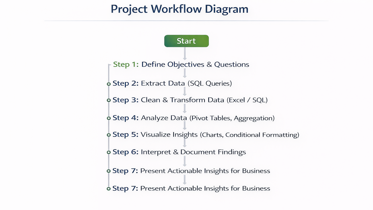
Step 5: Project Workflow Diagram
Step 6: Real-World Scenario
Scenario: A Nagpur retail chain wants to analyze quarterly sales:
- Extract regional revenue using SQL
- Identify top 5 products contributing to revenue
- Use Excel pivot tables to summarize revenue by product and month
- Visualize trends with line and column charts
- Detect anomalies and high-revenue outliers
- Compile an executive dashboard for store managers
Outcome: Management can optimize inventory, plan promotions, and improve product placement based on analytical insights.
At CuriosityTech.in, learners simulate this end-to-end project, integrating SQL extraction with Excel analysis to develop a complete real-world workflow, preparing them for professional analyst roles in 2025.
Common Mistakes
- Skipping data cleaning → inaccurate results
- Using incorrect aggregation functions → misleading insights
- Overcomplicating Excel dashboards → reduces readability
- Ignoring outliers → misinterpretation of trends
- Not documenting SQL queries or Excel steps → reduces reproducibility
Tips to Master Project-Based Analysis
- Always define clear objectives before starting analysis
- Use SQL for extraction, Excel for aggregation and visualization
- Combine charts and conditional formatting for insights
- Validate findings by cross-checking with raw data
- At CuriosityTech.in, learners complete multiple sales data projects to build a professional portfolio for analytics careers
Infographic Description: “Hands-On Sales Analysis Pipeline”
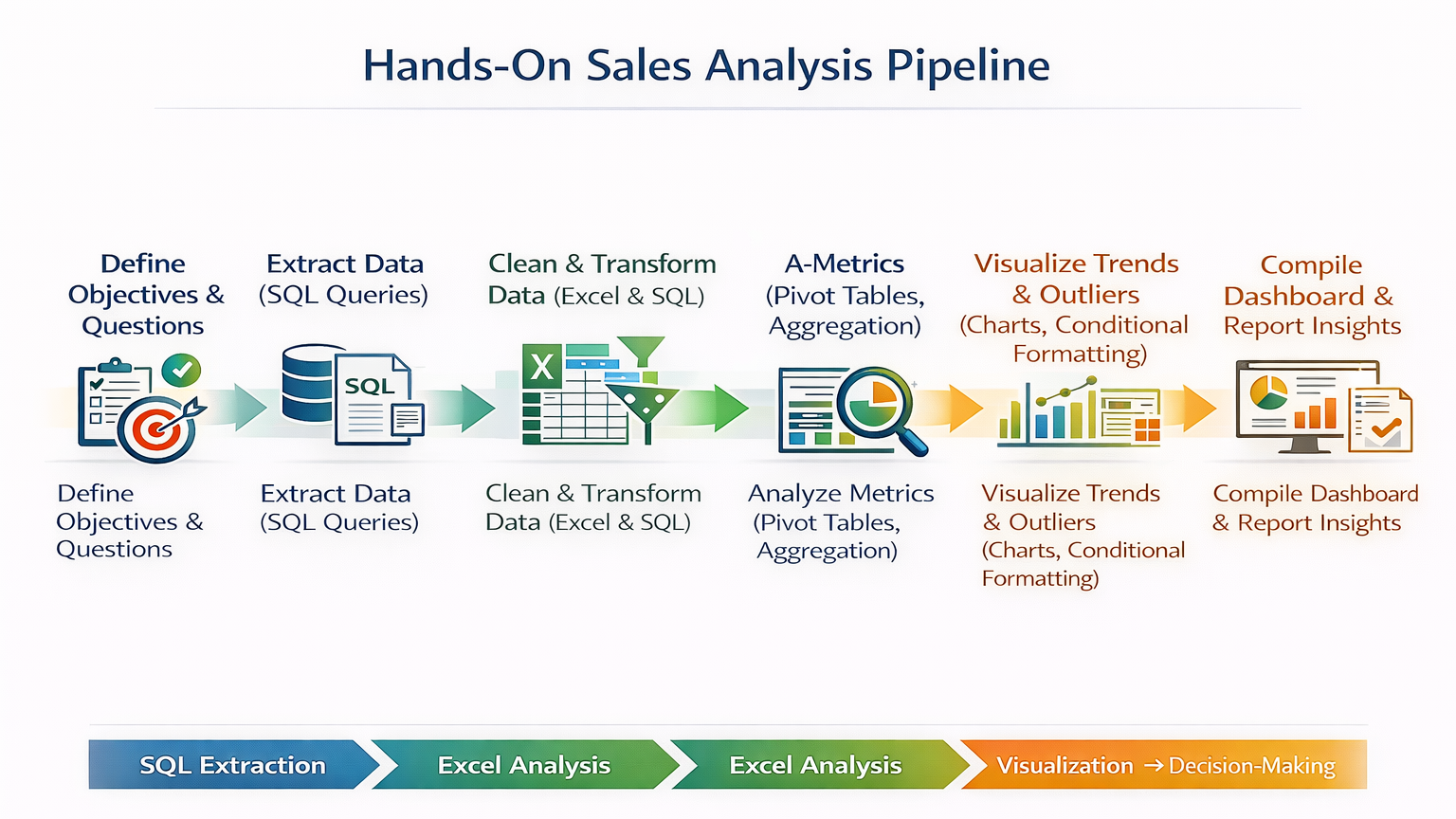
Visualize as a stepwise pipeline, connecting SQL extraction → Excel analysis → visualization → decision-making.
Conclusion
Hands-on projects build real-world analytical skills. By integrating SQL and Excel, analysts can extract, clean, analyze, and visualize sales data effectively, delivering actionable business insights.
At CuriosityTech.in, learners in Nagpur gain practical experience with live datasets, simulating professional workflows that prepare them for data analyst roles in 2025. Contact +91-9860555369 or contact@curiositytech.in to start your hands-on analytics projects.