
Introduction (Business Intelligence Workshop Style)
Power BI is a powerful business intelligence tool that transforms raw data into interactive dashboards, enabling companies to make data-driven decisions instantly. In 2025, organizations from startups in Nagpur to multinational corporations rely on Power BI for sales monitoring, financial reporting, and customer insights.
At CuriosityTech.in, learners experience hands-on workshops where they connect Power BI to Excel, SQL, or Python outputs and create dashboards that tell a story.
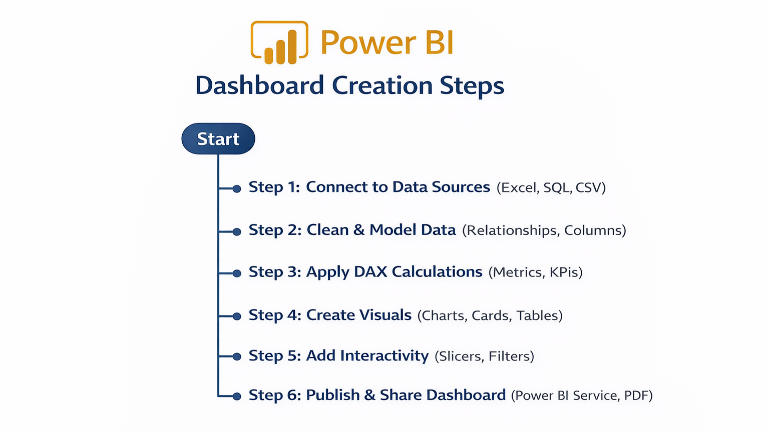
Step 1: Installing and Setting Up Power BI
- Download Power BI Desktop from Microsoft’s official site.
- Install and open the application.
- Connect to a dataset:
- Excel files
- SQL databases
- CSV files
Example: Import retail sales data from Excel for Nagpur store transactions.
Step 2: Data Modeling
- Purpose: Structure the data for effective reporting.
- Steps:
- Check tables and relationships
- Create relationships between Customers, Orders, Products
- Rename columns for clarity
Tip: Proper modeling ensures accurate calculations and dashboards.
Step 3: Using DAX (Data Analysis Expressions)
DAX allows advanced calculations in Power BI. Examples:
- Total Revenue:
- Total Revenue = SUM(Orders[Revenue])
- Profit Margin:
- Profit Margin = DIVIDE(SUM(Orders[Profit]), SUM(Orders[Revenue]))
- Filtering with conditions:
- High Sales = IF([Total Revenue] > 50000, “Yes”, “No”)
Step 4: Creating Visuals
Table of Visual Types & Use Cases:
| Visual Type | Purpose | Example Use Case |
| Column Chart | Compare categories | Sales by product |
| Line Chart | Show trends over time | Monthly revenue growth |
| Pie Chart | Show proportion | Market share by region |
| Map Visualization | Geo-analysis | Sales across cities/regions |
| Card Visual | Highlight key metrics | Total Revenue |
| Matrix/Table | Tabular summary with aggregations | Product-wise revenue per region |
| Slicer | Interactive filtering | Filter by Month, Region, Product |
Step-by-Step Visual Creation:
- Drag fields from the dataset to the Values pane.
- Choose a visual type from the Visualizations pane.
- Customize colors, titles, and labels.
- Use Slicers for interactive filtering.
Step 5: Creating Interactive Dashboards
Scenario: Nagpur retail store wants a weekly sales dashboard:
- Connect Excel dataset to Power BI.
- Create column chart for sales by product.
- Add line chart for revenue trends.
- Insert card visuals for total revenue and total orders.
- Apply slicers to filter by region and week.
- Arrange visuals in a dashboard layout for clarity.
Outcome: Management can interactively explore sales data, identify high-performing products, and make informed stocking decisions.
Power BI Workflow (Textual Flowchart)
Common Mistakes in Power BI
- Poor data modeling → incorrect aggregations
- Overcrowded dashboards → confusing for users
- Ignoring slicers → less interactive insights
- Using too many visuals → slows dashboard performance
- Not updating data sources → stale insights
Tips to Master Power BI
- Start with Excel datasets, then connect SQL or Python outputs.
- Practice DAX functions for calculations.
- Keep dashboards clean and interactive.
- Use templates for faster design initially.
- At CuriosityTech.in, learners create real-time dashboards using retail, finance, and healthcare datasets to simulate business scenarios in Nagpur.
Real-World Example (Hands-On Project)
Scenario: Analyze festive season sales in Nagpur:
- Connect POS Excel dataset to Power BI
- Use column charts to compare products
- Add line chart to show week-over-week trends
- Add card visuals for revenue and top product
- Use slicers for region, product category, and week
Result: Executives instantly identify high-performing products and underperforming regions, enabling strategic marketing and inventory planning.
Infographic Description: “Power BI Dashboard Creation Pipeline”
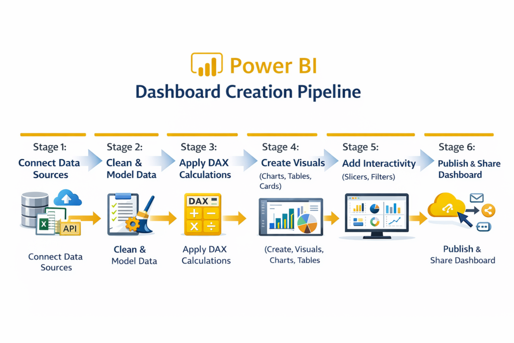
Visualize as a linear process flow with arrows linking each stage to the next.
Conclusion
Power BI empowers analysts to create interactive dashboards that transform raw data into actionable insights. In 2025, mastering Power BI is essential for analysts in business, finance, and operations.
At CuriosityTech.in, learners in Nagpur gain hands-on experience with live datasets, building dashboards from scratch, applying DAX, and adding interactivity for real-world business decisions. Contact us at +91-9860555369 or contact@curiositytech.in to start your Power BI journey.
Tags
#PowerBI #InteractiveDashboards #DataVisualization #CuriosityTech #BusinessIntelligence2025
Keywords
Power BI basics 2025, interactive dashboards tutorial, data visualization Power BI, create dashboards Nagpur, CuriosityTech training