

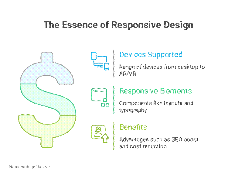
In the ever-evolving digital landscape, user experience is king. As we move deeper into 2025, the way users interact with websites is more diverse than ever—spanning desktops, tablets, smartphones, foldable devices, and even augmented reality interfaces. One critical aspect that ensures a seamless experience across this spectrum is responsive web design (RWD). In this article, we’ll dive deep into what responsive design is, why it is essential today, and how businesses like those featured on curiositytech.in can leverage it to stay ahead.
What Is Responsive Design?
Responsive design is a web development approach that ensures your website adapts fluidly to the size and orientation of the user’s device. Instead of creating separate sites for mobile and desktop users, a responsive website uses flexible grids, layouts, images, and CSS media queries to automatically adjust the content for any screen size.
Key Components of Responsive Design:
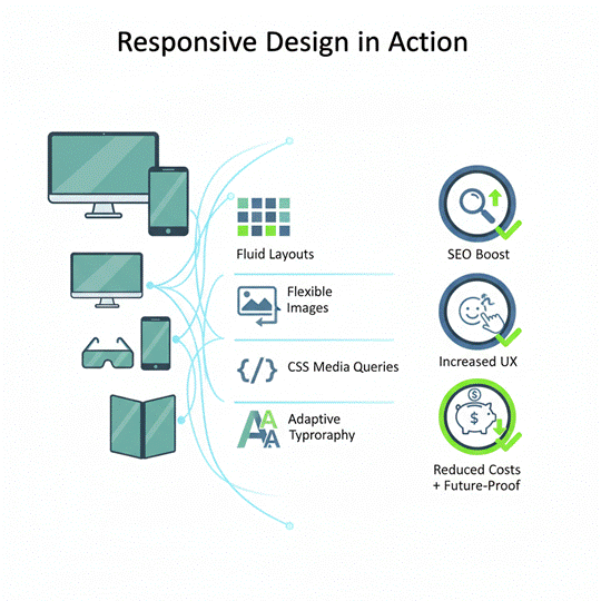
- Fluid Grid Layouts: Instead of fixed pixel widths, content elements scale proportionally.
- Flexible Images & Media: Images resize or switch depending on screen resolution.
- CSS Media Queries: Conditional rules that adjust styles for different devices.
- Adaptive Typography: Text resizes intelligently to maintain readability on all devices.
- Touch-Friendly Elements: Buttons and interactive elements are designed for touch as well as mouse input.
A well-executed responsive design ensures that whether a user is browsing from a 27-inch monitor or a 5-inch smartphone, their experience remains intuitive and visually appealing.
Why Responsive Design Matters in 2025
In 2025, web traffic is expected to continue shifting toward mobile and multi-device interactions. Here’s why responsive design isn’t just a luxury—it’s a necessity:
- Mobile-First Browsing Dominates:- Mobile users account for over 60% of global web traffic. Websites not optimized for smaller screens risk losing a significant portion of their audience. Curiositytech.in, for instance, emphasizes mobile accessibility to make its technology insights readily available for users on-the-go.
- Improved SEO Performance :- Search engines, especially Google, prioritize mobile-friendly and responsive websites. This means that websites with a strong responsive design are more likely to rank higher in search results, increasing visibility and organic traffic.
- Enhanced User Experience (UX) :- UX is no longer optional. A responsive site ensures consistent navigation, faster loading times, and visually appealing content on all devices, increasing user satisfaction and engagement.
- Cost Efficiency :- Maintaining one responsive website is more cost-effective than creating and updating separate mobile and desktop sites. Businesses can focus on optimizing a single platform while reaching a wider audience.
- Future-Proofing Against Emerging Devices :- Devices with unconventional screen sizes—like foldables, AR glasses, and ultra-wide monitors—are becoming more common. A responsive framework ensures your website adapts to these technologies without major redesigns.
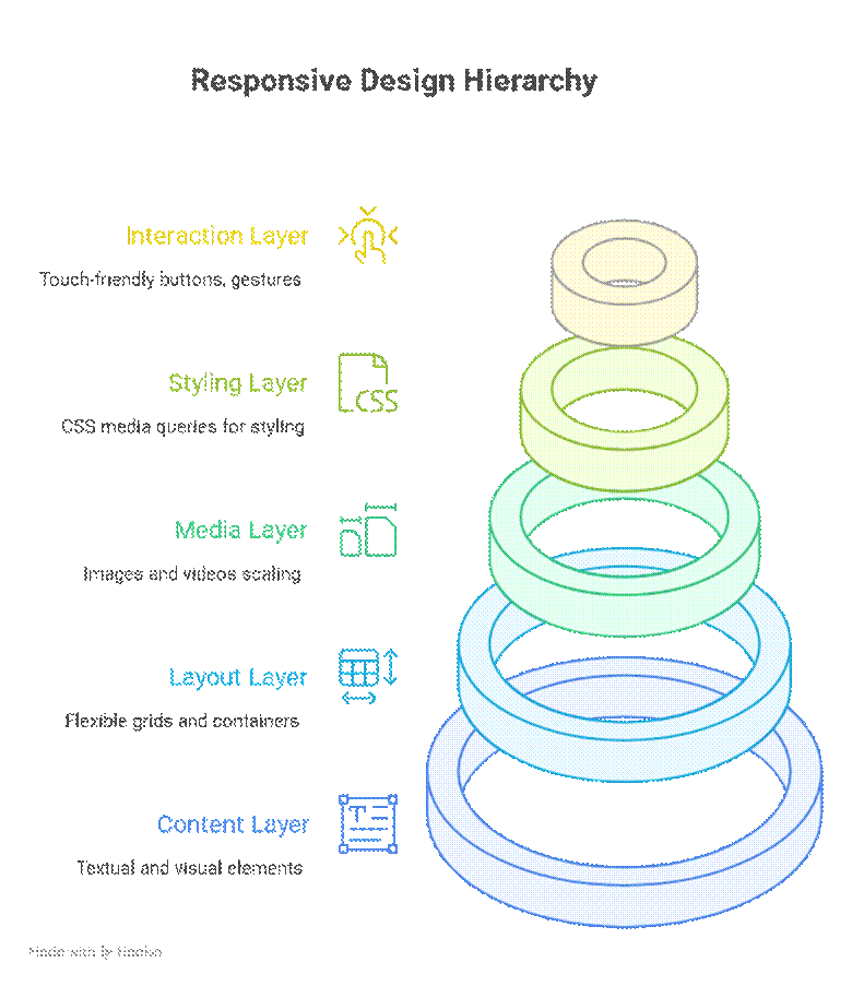
Hierarchical Structure of Responsive Design
Infographic Idea: “Responsive Design in Action”
Responsive Design Best Practices for 2025
- Start with Mobile-First Design:- Designing for the smallest screen ensures critical content is prioritized.
- Optimize Images & Media :- Use modern formats like WebP and SVGs. Compress images to enhance loading speed.
- Test Across Multiple Devices :- Use emulators and real devices to verify consistent experience.
- Prioritize Accessibility :- Ensure readable fonts, contrast ratios, and accessible navigation for all users.
- Leverage Frameworks Wisely :- Frameworks like Bootstrap 5 or Tailwind CSS offer responsive utilities, but custom tweaks ensure your brand identity stands out.
How CuriosityTech.in Implements Responsive Design
At CuriosityTech.in, responsive design is not just a technical choice—it’s a core part of their strategy to make technology education and business insights universally accessible. Whether a student is reading articles on AI, or a professional is learning about lead generation techniques, the website adapts seamlessly to provide:
- Smooth scrolling experiences
- Fast loading on mobile networks
- Accessible navigation menus for tablets and phones
- Consistent typography and visual hierarchy
By combining responsive design with engaging content, curiositytech.in ensures users return repeatedly, driving higher engagement and loyalty.
Conclusion
Responsive design in 2025 is more than a trend—it’s a necessity. With the surge in mobile usage, diverse devices, and the demand for superior user experiences, businesses that prioritize responsiveness are better positioned to succeed. From enhancing SEO to reducing maintenance costs, the benefits are clear. Websites like CuriosityTech.in set a benchmark by blending high-quality content with adaptive design, making it accessible, efficient, and future-ready.
Adopting responsive design is not just about technology; it’s about creating a website that respects the user’s device, context, and time—ensuring your digital presence remains relevant in an ever-changing world.

