
In today’s digital-first era, the majority of internet traffic comes from mobile devices. Users expect seamless experiences on their smartphones and tablets, which makes mobile-first design not just a trend, but a necessity for businesses and developers alike. Whether you’re a designer, developer, or business owner, embracing a mobile-first approach can dramatically improve usability, engagement, and conversion rates.
At CuriosityTech.in, we specialize in crafting intuitive, mobile-optimized experiences that resonate with users while aligning perfectly with business goals. From sleek layouts to fast-loading interfaces, our team ensures your digital presence is as dynamic as your audience demands.
What is Mobile-First Design?
Mobile-first design is a design strategy where the mobile user experience is prioritized before designing for desktop or larger screens. Instead of scaling down a desktop site for mobile users, this approach starts with the constraints of small screens, encouraging simplicity, focus, and performance optimization.
Why Mobile-First Matters:
- Over 60% of global web traffic comes from mobile devices.
- Google prioritizes mobile-friendly websites in its search results.
- Mobile-first design encourages clean layouts, fast loading times, and user-friendly navigation.
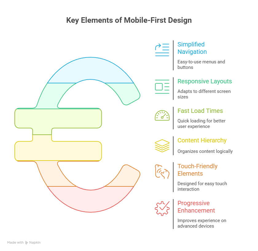
Core Principles of Mobile-First Design
Creating an effective mobile-first design requires attention to several key principles:
- Simplified Navigation :- Prioritize essential features. Mobile screens are limited, so menus should be concise, accessible, and easy to interact with.
- Responsive Layouts :- Ensure your site adapts seamlessly across screen sizes. Use flexible grids, scalable images, and CSS media queries.
- Fast Load Times :- Optimize images, minimize scripts, and leverage browser caching to reduce load times. Users expect sites to load in under 3 seconds.
- Content Hierarchy :- Present information in order of importance. The most critical content should appear at the top, visible without scrolling.
- Touch-Friendly Elements :- Buttons, links, and interactive elements must be appropriately sized and spaced for finger taps, avoiding user frustration.
- Progressive Enhancement :- Start with essential content and functionality, then progressively enhance the experience for larger screens with additional features.
Best Practices for Mobile-First Design
To design experiences that delight mobile users, follow these best practices:
- Start with the Smallest Screen :- Design for smartphones first, then scale up. This ensures that essential functionality isn’t lost on smaller devices.
- Prioritize Performance :- Users abandon slow-loading sites. Compress images, minimize JavaScript, and adopt modern frameworks to boost speed.
- Use Clear Typography :- Small screens demand larger, readable fonts and sufficient line spacing for readability.
- Leverage Visual Hierarchy :- Use size, color, and spacing to guide attention to critical elements like CTAs, forms, and important content.
- Test Across Devices :- Simulate experiences on multiple devices, browsers, and screen orientations to ensure consistency.
- Engage Users with Interactive Elements :- Smooth animations, swipes, and collapsible menus can enhance engagement without overwhelming the user.
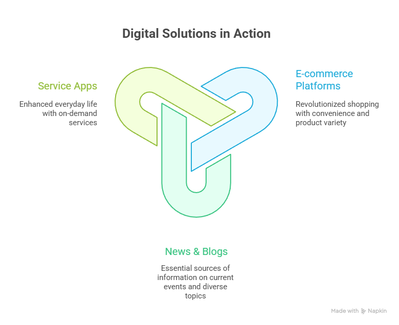
Real-World Examples
- E-commerce Platforms: Mobile-first designs simplify browsing and checkout, improving conversion rates. Popular brands like Amazon prioritize speed, product visibility, and thumb-friendly interactions.
- News & Blogs: Apps like Medium or BBC News optimize readability, font scaling, and quick load times for users on the go.
- Service Apps: Banking and utility apps (e.g., Paytm, Google Pay) focus on clear navigation, secure touch inputs, and instant feedback to enhance user confidence.
At CuriosityTech.in, we integrate these best practices into every project. Whether it’s crafting interactive mobile apps or responsive websites, we ensure users have an engaging, effortless experience across all devices.
This visual can be placed mid-blog to engage readers and summarize the key takeaways.
Benefits of Mobile-First Design
- Improved SEO: Google prioritizes mobile-friendly sites in search results.
- Enhanced User Experience: Simplified layouts reduce frustration and increase engagement.
- Higher Conversion Rates: Mobile-first sites remove friction in user journeys.
- Future-Proofing: Prepares websites for the growing mobile audience and emerging devices.
Conclusion
Mobile-first design is no longer optional—it’s essential. By focusing on mobile users first, designers and developers can create experiences that are fast, intuitive, and visually appealing. At CuriosityTech.in, we combine technical expertise with a deep understanding of user behavior to deliver mobile-first solutions that make a tangible impact. From responsive websites to mobile apps, our goal is to ensure your digital presence is always at its best, no matter the screen size.