

Introduction
While Python dominates the data science landscape, R programming remains a vital tool, especially for statistical analysis, visualization, and academic research. In 2025, top data scientists often combine Python and R to handle complex datasets efficiently.
At CuriosityTech.in, our learners in Nagpur explore both languages to become versatile professionals, able to handle business analytics, machine learning, and statistical modeling.
This blog will guide beginners through R programming, explain its key libraries, workflows, and real-world applications, and showcase how to integrate it into a data scientist’s toolkit.
Why Learn R for Data Science?
- Statistical Expertise – R was built for statistics. Functions for regression, ANOVA, and hypothesis testing are native.
- Data Visualization Excellence – Packages like ggplot2 allow detailed and aesthetic visualizations.
- Data Wrangling Power – Libraries like dplyr and tidyr streamline data cleaning.
- Integration with Python & SQL – R can be combined with Python via reticulate and handle database queries seamlessly.
- Open-Source & Community Support – Thousands of packages for finance, bioinformatics, marketing analytics.
Section 1 – R Programming Basics
Installation & Setup
- Download R and RStudio IDE for interactive coding.
- Optional: Install packages using install.packages(“packageName”).
Core Concepts
Vectors & Lists:
ages <- c(22, 25, 30, 28)
names <- list(“Alice”, “Bob”, “Charlie”)
- Data Frames:
employee <- data.frame(Name=c(“Alice”,”Bob”), Salary=c(50000,60000))
- Basic Operations:
mean(employee$Salary)
summary(employee)
Section 2 – Data Manipulation with dplyr
dplyr is the go-to library for data wrangling.
Key Functions:
- filter() – select rows
- select() – choose columns
- mutate() – create new columns
- summarise() – aggregate data
- group_by() – group and analyze
Example Case Study: An edtech startup wants to analyze student test scores to identify high performers. Using R:
library(dplyr)
top_students <- student_data %>%
group_by(Class) %>%
summarise(avg_score = mean(Score)) %>%
filter(avg_score > 85)
Outcome: Identifies classes performing above average and guides targeted interventions.
Section 3 – Data Visualization with ggplot2
ggplot2 is R’s flagship visualization package for exploratory and presentation-ready graphics.
Components of a ggplot:
- Data layer – dataset being visualized
- Aesthetic mapping (aes) – axes, color, shape
- Geometric objects (geom) – bar, line, point
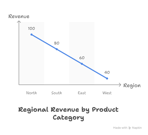
Example: Plotting Sales by Region
library(ggplot2)
ggplot(sales_data, aes(x=Region, y=Revenue)) +
geom_bar(stat=”identity”, fill=”blue”) +
theme_minimal() +
labs(title=”Regional Revenue Analysis”)
Insight: Businesses can quickly identify high-performing regions and adjust marketing efforts.
Infographic Description:
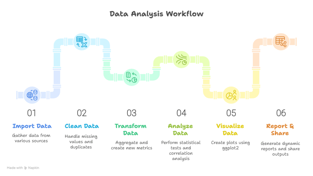
Section 4 – Workflow: From Raw Data to Insights
- Import Data: CSV, Excel, or SQL databases
- Clean Data: Handle missing values, remove duplicates using tidyr
- Transform Data: Use dplyr functions for aggregations and new metrics
- Analyze: Perform statistical tests, correlation analysis
- Visualize: ggplot2 for plots; combine multiple layers for insights
- Report & Share: RMarkdown for dynamic reports, PDF or HTML outputs
Conceptual Diagram:
Section 5 – R vs Python: When to Use What
| Features | R | Python | Use Case |
| Ease of Learning | Medium | Easy | Beginners in programming |
| Statistical Analysis | Excellent | Good (with libraries) | Academic or finance research |
| Data Visualization | Excellent (ggplot2) | Good (Matplotlib/Seaborn) | Business dashboards and reporting |
| Machine Learning | Good (caret, ML packages) | Excellent (Scikit-learn, TensorFlow) | Predictive modeling |
| Community & Resources | Strong (statistics) | Very Strong (AI/ML) | General data science and AI projects |
Tip: Learn both languages for maximum flexibility.
Section 6 – Real-World Case Study
Scenario: A healthcare provider wants to predict patient readmission.
- Step 1: Import patient records using R
- Step 2: Clean missing values for age, diagnosis, and discharge data
- Step 3: Analyze correlations between chronic conditions and readmission
- Step 4: Visualize trends in readmissions across hospital departments
- Step 5: Report insights in RMarkdown to hospital management
Impact: Hospital can target high-risk patients, reducing readmission by 15%.
Section 7 – Tips to Become an Expert in R
- Master data frames and vectorized operations.
- Learn dplyr and tidyr thoroughly for wrangling.
- Practice ggplot2 layers and themes for professional visualizations.
- Explore RMarkdown for dynamic reports.
- Apply R to real datasets, preferably projects that align with career goals.
- At CuriosityTech.in, our learners engage in hands-on R projects, including predictive analytics, dashboards, and statistical modeling simulations.
Conclusion
R programming remains a cornerstone of data science in 2025, especially for professionals focusing on statistics, analytics, and visualization. When combined with Python, SQL, and cloud tools, R empowers you to turn complex data into actionable insights.
At CuriosityTech.in, we provide structured R learning programs, mentorship, and real-world projects, enabling learners to become industry-ready data scientists. Reach out at +91-9860555369 or contact@curiositytech.in, and follow us on LinkedIn: Curiosity Tech, Instagram: CuriosityTech Park for updates and resources.

