
Introduction
Exploratory Data Analysis (EDA) is the foundation of modern data science.
It helps data scientists detect patterns, spot anomalies, and uncover insights before building machine learning models.
At Curiosity Tech Nagpur, we focus on hands-on EDA training.
We teach learners how to use Python’s visualization libraries to make confident, data-driven decisions.
This guide explores Seaborn and Plotly—two powerful libraries for data visualization—and provides step-by-step examples, visual storytelling techniques, and practical insights.
Section 1 – What is EDA and Why It Matters
In simple terms, EDA is the process of summarizing and visualizing data to:
- Identify missing or inconsistent values
- Detect outliers
- Discover trends, correlations, and patterns
- Prepare data for modeling and business insights
Example Story: A retail startup at CuriosityTech used EDA to analyze sales data. By visualizing regional sales trends with Seaborn, they discovered one underperforming region contributing disproportionately to losses. The team implemented actionable insights.
As a result, revenue improved by 18%.
Infographic Description:
Section 2 – Seaborn: Statistical Visualizations Made Easy
Seaborn is built on Matplotlib.
In addition, it simplifies statistical plotting.
Key Plots with Examples
- Distribution Plot (distplot / histplot)
import seaborn as sns
sns.histplot(df[‘Sales’], kde=True)
- Purpose: Check distribution of numeric variables
- Insight: Detect skewness or unusual spikes
- Box Plot
sns.boxplot(x=’Region’, y=’Revenue’, data=df)
- Purpose: Identify outliers and distribution per category
- Insight: Highlights regions with unusually high or low revenue
- Correlation Heatmap
sns.heatmap(df.corr(), annot=True)
- Purpose: Explore relationships between numeric features
- Insight: Determines features that influence target variables
Section 3 – Plotly: Interactive Visualizations
Unlike static charts, Plotly visualizations allow users to explore data dynamically.
Key Visualizations
- Interactive Scatter Plot
import plotly.express as px
fig = px.scatter(df, x=’Marketing_Spend’, y=’Revenue’, color=’Region’, size=’Sales’)
fig.show()
- Insight: Understand relationships between variables dynamically
- Interactive Line Chart
fig = px.line(df, x=’Month’, y=’Revenue’, color=’Region’)
fig.show()
- Insight: Track trends over time for multiple regions
- Interactive Pie Chart
fig = px.pie(df, names=’Product_Category’, values=’Revenue’)
fig.show()
- Insight: Visualize proportional contributions of product categories
Section 4 – EDA Workflow: Step-by-Step
Step 1: Import Libraries & Dataset
import pandas as pd
import seaborn as sns
import plotly.express as px
df = pd.read_csv(‘retail_sales.csv’)
Step 2: Summary Statistics
- df.describe()
- df.info()
- Identify missing or erroneous values
Step 3: Univariate Analysis
- Histogram or Box Plot to explore single variables
Step 4: Bivariate/Multivariate Analysis
- Correlation heatmap
- Scatter plots for relationships between features
Step 5: Feature Insights
- Identify patterns like top-selling regions, seasonal trends, and revenue drivers
Step 6: Visual Storytelling
- Use Seaborn for detailed static plots
- Use Plotly for interactive dashboards
- Present findings to stakeholders with actionable recommendations
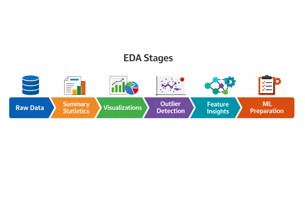
Infographic Description:
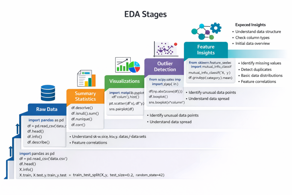
- A step ladder diagram showing each EDA stage
- Each step annotated with Python code snippet examples and expected insights
Section 5 – Python Libraries Comparison for EDA
| Feature | Seaborn | Plotly | Use Case |
| Interactivity | No | Yes | Dashboards, web reports |
| Ease of Use | High | Moderate | Quick exploratory plots |
| Statistical Plot Support | Excellent | Limited | Histograms, boxplots, KDE |
| Presentation Ready | Good | Excellent | Interactive presentations |
| Integration | Matplotlib | Jupyter, Web apps | Advanced dashboards |
Section 6 – Real-World Case Study
Step 1: Identify Outliers
Seaborn boxplots reveal that Region C has extreme revenue values.
Step 2: Analyze Correlations
Correlation heatmaps show that marketing spend strongly influences sales.
Step 3: Build Interactive Dashboard
Scenario: An FMCG company wants to identify sales trends and outliers across products and regions.
Impact: Using EDA, the company optimized marketing spend, corrected pricing anomalies, and improved forecast accuracy by 20%.
Section 7 – Tips for EDA Mastery
- Always visualize distributions before modeling
- Detect outliers using boxplots or IQR method
- Combine static and interactive charts for stakeholders
- Practice on real datasets from Kaggle, UCI, or company projects
- Document insights with storytelling: What the data shows → Why it matters → Suggested action
CuriosityTech Tip: Learners in our programs create complete EDA reports using Seaborn and Plotly, building a portfolio that impresses recruiters.
Conclusion
EDA is the detective work of data science. By mastering Seaborn for statistical plots and Plotly for interactive dashboards, data scientists can unlock insights, detect anomalies, and communicate effectively.
At Curiosity Tech, Nagpur, our hands-on EDA training ensures learners transition from raw data to actionable insights with confidence. Contact us at +91-9860555369 or contact@curiositytech.in, and follow us on Instagram: CuriosityTechPark and LinkedIn: Curiosity Tech for resources and updates.

